A visitor clicks a link to your website. Five seconds pass, and the screen remains blank. By the sixth second, they have already closed the tab and moved on to a competitor. This scenario plays out millions of times a day across the internet. Users expect instant gratification, and search engines penalize sites that fail to deliver it.
Your digital storefront needs to look great, load instantly, and adapt to any device. Achieving this requires a careful balance of aesthetic planning and technical execution. When a site performs poorly, it drives away potential customers and damages brand trust. Conversely, a highly optimized site keeps users engaged, reduces bounce rates, and increases conversions.
This guide explores practical strategies for creating websites that prioritize both speed and adaptability. You will learn actionable techniques to improve load times and ensure your site functions flawlessly on everything from desktop monitors to mobile phones. As experts in this space, SanMo BD understands exactly what it takes to build a high-performing digital presence from the ground up.
Why Speed and Responsiveness Matter
 The intersection of web design & development dictates how users experience your brand. A visually stunning page means very little if it takes a minute to load.
The Impact on User Engagement
When a site loads quickly, users are more likely to explore multiple pages. They read your content, interact with your forms, and purchase your products. Slow load times cause frustration. Studies consistently show that even a one-second delay in page response can result in a significant drop in conversions. Responsiveness plays a similar role. If a user visits your site on a smartphone and has to pinch and zoom to read the text, they will likely leave.
Search Engine Visibility
Search engines want to provide the best possible results to their users. Google uses page speed and mobile-friendliness as direct ranking factors. A responsive, fast-loading site signals to search algorithms that your page provides a good user experience. This helps your content rank higher in search results, driving more organic traffic to your business.
Core Strategies for Fast Web Design
Speed optimization should start during the initial design phase, long before any code is written. Every element added to a page impacts its final load time.
Optimize Images and Media
Large image files are one of the most common causes of slow websites. High-resolution photos take up a massive amount of bandwidth.
- Resize appropriately: Never upload a 4000-pixel-wide image if it will only display at 400 pixels on the screen.
- Compress files: Use tools to compress images without losing noticeable quality.
- Use modern formats: WebP and AVIF formats provide superior compression compared to traditional JPEG and PNG files.
- Lazy loading: Implement lazy loading so images only load when a user scrolls down to them.
Streamline Your Code
Web browsers have to read your HTML, CSS, and JavaScript before they can display your site. Messy or bloated code slows this process down. Minification removes unnecessary characters, such as white space, comments, and line breaks, from your source code. This reduces file sizes and speeds up the time it takes for the browser to download and execute the files.
Leverage Browser Caching
When someone visits your website, their browser downloads various assets like logos, stylesheets, and scripts. Browser caching allows you to store these files on the user’s local device for a specified period. When they navigate to a new page on your site or return at a later date, their browser loads these files locally instead of downloading them again from your server. This drastically reduces load times for returning visitors.
Best Practices for Responsive Web Development
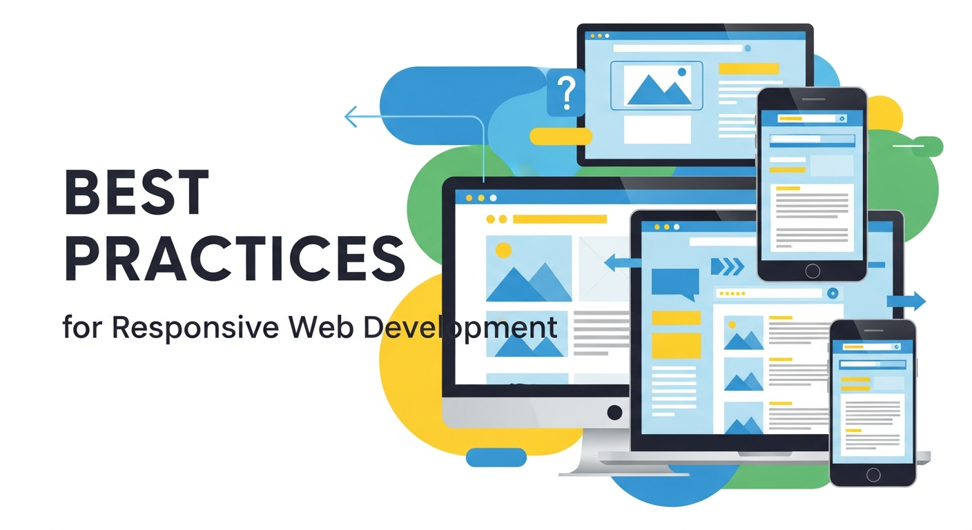 A responsive website fluidly adjusts its layout to fit the screen size of the device being used. This requires specific coding techniques and a flexible mindset.
Adopt a Mobile-First Approach
Designing for mobile devices first forces you to prioritize essential content. Mobile screens have limited space, so you must decide what information is most important. Once you have a functional and clean mobile layout, you can progressively enhance the design for larger screens by adding more complex layouts and features. This approach ensures your site remains clean, functional, and fast on all devices.
Utilize Flexible Grid Foundations
Traditional web design relied on fixed-width layouts based on pixels. Responsive web design & development relies on fluid grids. Fluid grids use relative units, like percentages, to define the width of page elements. If a screen shrinks, the elements shrink proportionally. This prevents horizontal scrolling and ensures the design maintains its integrity regardless of the viewport size.
Implement CSS Media Queries
Media queries are the backbone of responsive development. They allow you to apply different CSS styles based on the characteristics of the user’s device, such as its width, height, or orientation. For example, a media query can tell the browser to display a navigation menu as a horizontal list on a desktop and as a collapsible “hamburger” menu on a smartphone.
How SanMo BD Elevates Your Digital Presence
Building a site that excels in both speed and responsiveness requires technical expertise and strategic planning. SanMo BD specializes in premium web design & development, crafting digital experiences that look beautiful and perform exceptionally well.
Our team focuses on writing clean code, optimizing media assets, and implementing robust responsive frameworks. We ensure your website serves as a powerful tool for your business, keeping users engaged and driving tangible results. We test extensively across devices and network conditions to guarantee your audience receives a seamless experience every time they visit your site.
The Role of UX/UI Design in Website Performance
 User experience (UX) and user interface (UI) design play a critical role in how visitors interact with your website. A clean, intuitive design helps users find what they need quickly, reducing frustration and improving engagement. Good UX focuses on functionality, while UI ensures the visual elements are appealing and consistent. Together, they create a seamless experience that keeps users on your site longer. Poor design choices, such as cluttered layouts or confusing navigation, can negatively impact performance and increase bounce rates. By prioritizing UX/UI in web design & development, you ensure that your website is both visually attractive and highly functional.
Importance of Website Security in Development
Website security is a crucial aspect of modern web development. Cyber threats continue to evolve, making it essential to protect your site and user data. Implementing SSL certificates, secure authentication methods, and regular updates helps safeguard your website from attacks. A secure website not only protects sensitive information but also builds trust with your audience. Search engines also favor secure websites, improving your rankings. Neglecting security can lead to data breaches, loss of credibility, and financial damage. Incorporating strong security practices into your web design & development process ensures long-term reliability and user confidence.
Content Strategy for Better Engagement
 Content is the backbone of any successful website. High-quality, relevant content attracts visitors and keeps them engaged. Your content strategy should align with your audience’s needs and provide valuable information. Use clear headings, engaging visuals, and concise messaging to enhance readability. Regularly updating your content keeps your website fresh and relevant. Incorporating SEO best practices helps improve visibility and drive organic traffic. A well-planned content strategy supports your web design & development efforts by ensuring your site delivers meaningful value to users, encouraging them to stay longer and explore more.
The Importance of Website Accessibility
Accessibility ensures that your website can be used by everyone, including people with disabilities. This includes implementing features such as alt text for images, keyboard navigation, and proper color contrast. Accessible design improves usability for all users, not just those with disabilities. It also helps you comply with legal standards and guidelines. Search engines favor accessible websites because they provide a better user experience. By prioritizing accessibility in web design & development, you expand your audience reach and demonstrate a commitment to inclusivity and user satisfaction.
Performance Testing and Optimization Tools
Testing is essential to ensure your website performs at its best. Performance testing tools help identify issues that may slow down your site. Tools like load testers and speed analyzers provide insights into page performance and user experience. Regular testing allows you to detect problems early and fix them before they impact users. Optimization techniques, such as reducing server response time and improving code efficiency, enhance overall performance. Integrating testing into your web design & development workflow ensures your site remains fast, reliable, and capable of handling increasing traffic demands.
The Power of Call-to-Actions (CTAs)
Call-to-actions (CTAs) guide users toward taking specific actions on your website. Whether it is signing up for a newsletter, making a purchase, or contacting your business, effective CTAs improve conversions. Clear and compelling CTA buttons should stand out visually and use persuasive language. Placement is equally important; CTAs should appear at strategic points throughout your site. Testing different variations can help determine what works best for your audience. Incorporating strong CTAs into your web design & development strategy ensures that your website not only attracts visitors but also converts them into customers.
Integrating Analytics for Continuous Improvement
Analytics tools provide valuable insights into how users interact with your website. Tracking metrics such as page views, bounce rates, and user behavior helps you understand what is working and what needs improvement. These insights allow you to make data-driven decisions that enhance user experience and performance. Regular analysis helps identify trends and opportunities for growth. By integrating analytics into your web design & development process, you create a feedback loop that supports continuous optimization. This ensures your website evolves alongside user expectations and market trends.
The Impact of Hosting and Server Performance
Your hosting provider directly affects your website’s speed and reliability. A high-quality hosting service ensures fast server response times and minimal downtime. Poor hosting can lead to slow load speeds and frequent outages, negatively impacting user experience. Choosing the right hosting solution depends on your website’s size and traffic requirements. Options such as cloud hosting and dedicated servers offer better performance and scalability. Investing in reliable hosting is a fundamental part of web design & development, ensuring your website remains accessible and performs consistently under varying conditions.
Future Trends in Web Design & Development
Web design & development continues to evolve with new technologies and user expectations. Trends such as artificial intelligence, voice interfaces, and progressive web apps are shaping the future of websites. Businesses must stay updated with these advancements to remain competitive. Incorporating modern design trends and technologies enhances user experience and keeps your site relevant. Continuous learning and adaptation are essential in this dynamic field. By staying ahead of emerging trends, you can ensure your website remains innovative, efficient, and capable of meeting the demands of modern users.
Frequently Asked Questions (FAQ)
How often should I update my website’s design?
You should aim to refresh your site every two to three years. Technology and user expectations change rapidly. Regular updates ensure your site remains secure, fast, and aligned with modern web standards.
What is the difference between mobile-friendly and responsive design?
A mobile-friendly site looks the same on a phone as it does on a desktop, just scaled down. A responsive site actually changes its layout and design elements to perfectly fit the specific screen size, providing a much better user experience.
Does web hosting affect site speed?
Yes, your hosting provider plays a massive role in performance. Cheap, shared hosting plans often result in slow server response times. Investing in reliable hosting ensures your optimized code and media files are delivered to users as quickly as possible.
Can I check my own website’s speed?
Absolutely. Tools like Google PageSpeed Insights and GTmetrix allow you to enter your URL and receive a detailed report on your load times, along with specific recommendations for improvement.
Build a Website That Lasts
A successful online presence relies on a solid technical foundation. By prioritizing fast load times and responsive layouts, you provide a frictionless experience that keeps visitors coming back. Focus on optimizing your media, writing clean code, and building fluid layouts that adapt to any screen.
If you are ready to transform your digital strategy, contact SanMo BD. Let our web design & development experts build a fast, responsive site that drives your business forward.